Field settings
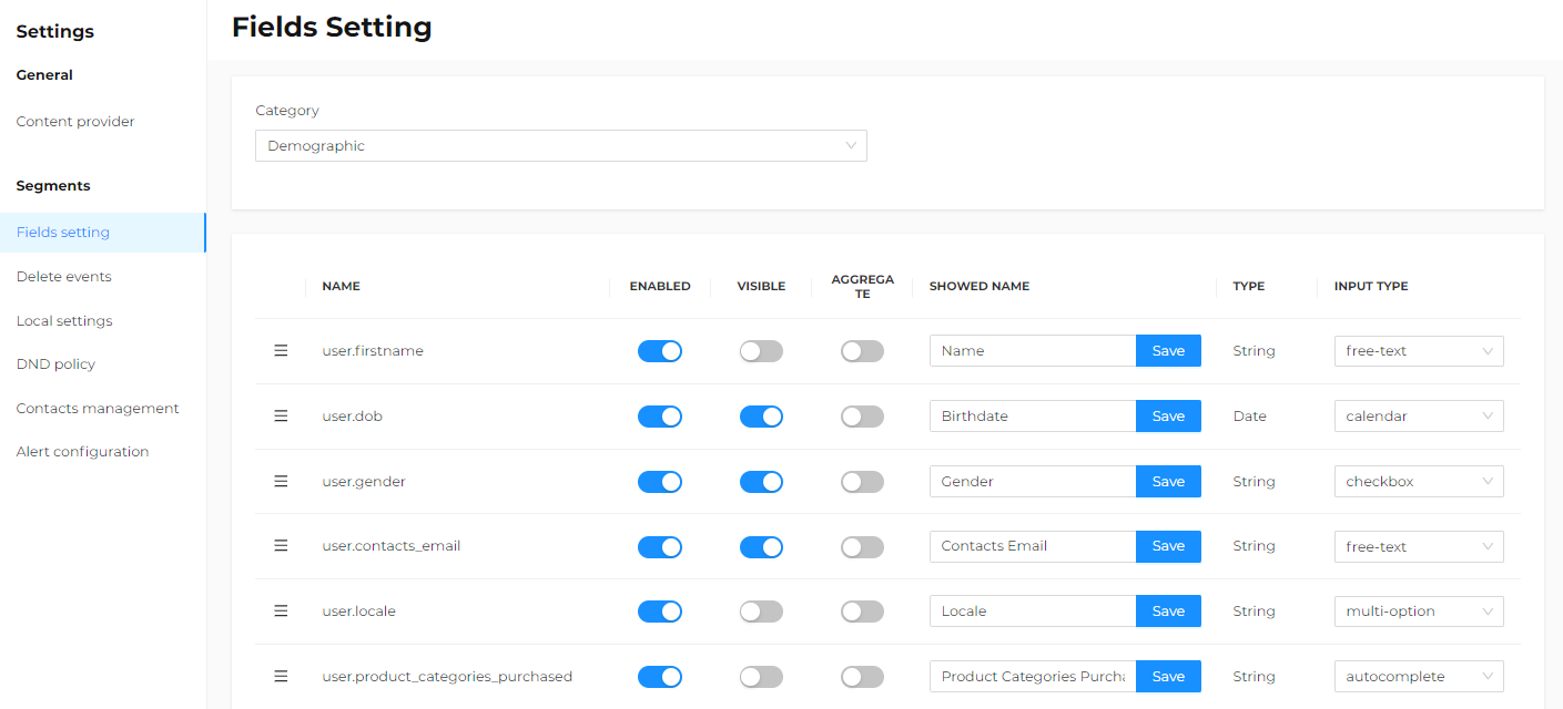
The Settings > Segments > Field settings section allows you to view the settings for each condition that can be used during segmentation to create a new rule.
Conditions are set when the system is configured. However, if you have admin permissions, you can modify some settings.
You can choose the type of field to modify using the drop-down menu.
The categories displayed depend on the system configuration and the database used, but may include:
-
DEMOGRAPHIC - Demographic
For example, date of birth, country, language of a contact, etc. -
DIGITAL COMMUNICATIONS - Clicks
For example, delivery ID, email domain that clicked, and similar. -
DIGITAL COMMUNICATIONS - Deliveries
For example, delivery ID, email domain of delivery, and similar. -
DIGITAL COMMUNICATIONS - Views
For example, delivery ID, email domain of opening, etc. -
PURCHASES - Orders
For example, order total, payment method, currency, discount, etc. -
PURCHASES - Order Lines
For example, order line total, price, quantity purchased, product name, etc. -
Retail EVENTS - Retaile events
For example, store location, event date, city, and similar. -
COUPON - Coupon
For example, event date, redemption date, amount redeemed, and similar.
For each field type, it is possible to view and modify:
- Three-line icon
Allows you to modify the display order of the fields simply by clicking the icon and moving the field to the desired position (drag and drop). You can move the attributes this way, and saving is contextual, meaning changes are saved automatically without needing to manually save. The new order is visible only during segment creation and not when an already generated segment is opened, which will show the order valid at the time of its first saving. - Enabled
By selecting this option, the condition is made available during segmentation. - Visible
Identifies the fields that should be displayed on the custom rule creation page. Other fields are still available in the drop-down menu at the bottom of the page. - Aggregate
Identifies fields on which operators such as SUM, COUNT, MAX, MIN, and AVERAGE can be applied. Enable only on numeric fields, such as order total. - Showed name
Name displayed during rule creation. If this field is modified, the language settings are ignored, and the assigned name appears the same in all languages. - Input type
Allows you to select the input field type from those available for that specific data type. Only appropriate field types are shown in the drop-down menu.

Data Types
The Segments functionality mainly handles three data types:
-
String
Attributes with a string data type have alphanumeric values that can consist of more than one word. For example, the store name attribute can have a value like Store N.5. -
Numeric
Attributes with a numeric data type can only have numeric values, such as integers, long integers, floating-point numbers, real numbers, and so on. For example, the purchase number attribute can have a value like 1, 2, 3, while the attribute number of items in the order can have a value like 1, 2, 3 or -1, -2 when returns occur. -
Date
Attributes with a date type have values in the format DD/MM/YYYY.
The type is defined by the platform based on the data type and cannot be modified.
Input Field Types
-
Checkbox
Checkbox input fields are used by default for all attributes within the database that have a number of different values equal to or less than five. For example, the Gender attribute has two values, M or F, and is represented by a checkbox. All available values for a particular attribute are shown, and one or more can be selected. When multiple values are chosen, the condition includes all contacts that satisfy at least one of the relevant values.Example:
The Store Category attribute has ecommerce, flagship store, and mall as possible values to identify the type of store where the purchase was made. If only ecommerce is selected, the platform returns contacts who have purchased at least once from the ecommerce site. If both ecommerce and mall are selected, it returns contacts who have purchased at least once either from the ecommerce site or from physical stores in shopping malls. -
Multi-option
Multiple selection input fields are used by default for all attributes within the database that have between five and 50 different values. The interface shows a scrolling menu containing the available values. Values not immediately visible can be read by scrolling down. Clicking on a value selects it, and it is highlighted. Multiple values can be selected by holding the CTRL key on the keyboard while selecting the desired values. These are also highlighted. Holding CTRL and clicking a previously selected value will deselect it, and it will no longer be highlighted. When more than one value is selected, the condition includes all contacts that satisfy at least one of the chosen values. -
Autocomplete
Autocomplete input fields are used by default for all attributes within the database that have between 50 and 5000 different values. The user interface shows an editable text box containing the placeholder text e.g. and some sample values. When two or more characters are typed into the text box, the platform automatically displays all available values containing those characters in a scrolling list. Click the required value to select it. Once selected, the text box returns to its original state, and the selected value is displayed below the box. Additional values can be selected by repeating the indicated steps. Once selected, a value can be removed by clicking the X icon next to it. When multiple values are selected, the condition includes all contacts that meet at least one of the specified values.warningText boxes are case-sensitive.
-
Free text
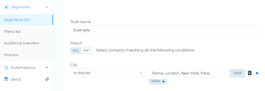
Free text input fields are used for all attributes within the database that have several thousand different values. Attributes such as Name or City are typical examples of this field type. The interface shows an editable text box containing the placeholder text Write here. Any required character can be typed into the free text box and then used as a value for the condition. For example, for a City attribute, type Milan to identify all contacts with that name. In this field type, only one value can be entered at a time.If multiple values are needed for an attribute with a free text input field, proceed as follows:
- Select In the list from the drop-down menu.
- Type the first value you want to add into the text box and click Add.
- Repeat the operation for all values to be added, according to your needs.
- If you want to enter a large number of values, copy and paste the desired values separated by commas and click Add.
 warning
Text boxes are case-sensitive.
-
Drill Down
This is a particular type of input field that can be useful when attributes are hierarchically related in a parent-child relationship. For example, when possible values of an attribute depend on the value selected for the parent attribute. Typical examples are attributes related to location, such as Continent, Country, Region, and City. In this type of input field, only one value can be selected at a time for each level. -
Number
Numeric input fields are used only for attributes that have a numeric data type. The interface allows you to either manually enter a numeric value or select one using the arrow keys. -
Calendar
Calendar input fields are used only for attributes with a date type. The interface displays a graphical widget showing the current calendar, allowing you to select the desired date. The interface shows an editable text box containing the text DD/MM/YYYY.infoBy clicking on the arrows, date-based input fields allow you to choose:
- An absolute date using the calendar widget, or:
- A relative date, for example, one week or two months ahead.
-
Calendar-time
Calendar-time input fields are used for attributes that have a date and time type. -
Relative date
Relative date input fields are used only for attributes that have a date data type.