Working with content in Email Designer
Introduction
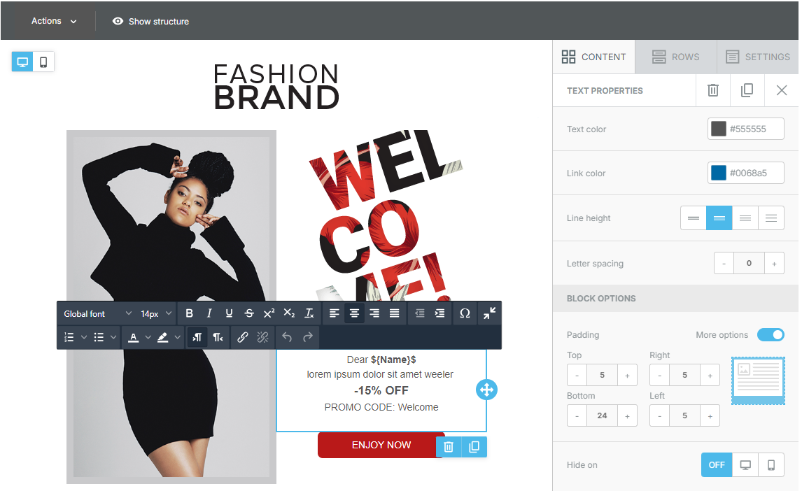
The Content section is the core of the workspace. Here, a variety of blocks are available to help design email content. To use these content blocks, simply drag and drop them into a column within the workspace. The content will automatically adapt to the width of the selected column.
Each content block has specific settings that allow you to customize details like padding and other parameters. Additionally, you can choose whether to hide an element from desktop or mobile view.
This tab automatically updates to show the properties of the selected content block, making editing and personalizing content blocks simple and intuitive.
Below is a description of the different types of content blocks available in the editor.
Title
The Title block allows you to insert main text, such as headings or titles. When you drag a title into the workspace, you can immediately edit it by clicking on it.
You can change the text, color, and apply effects such as bold or italic.
In the block properties panel, advanced options are available to adjust the spacing around the title, margin, and width.
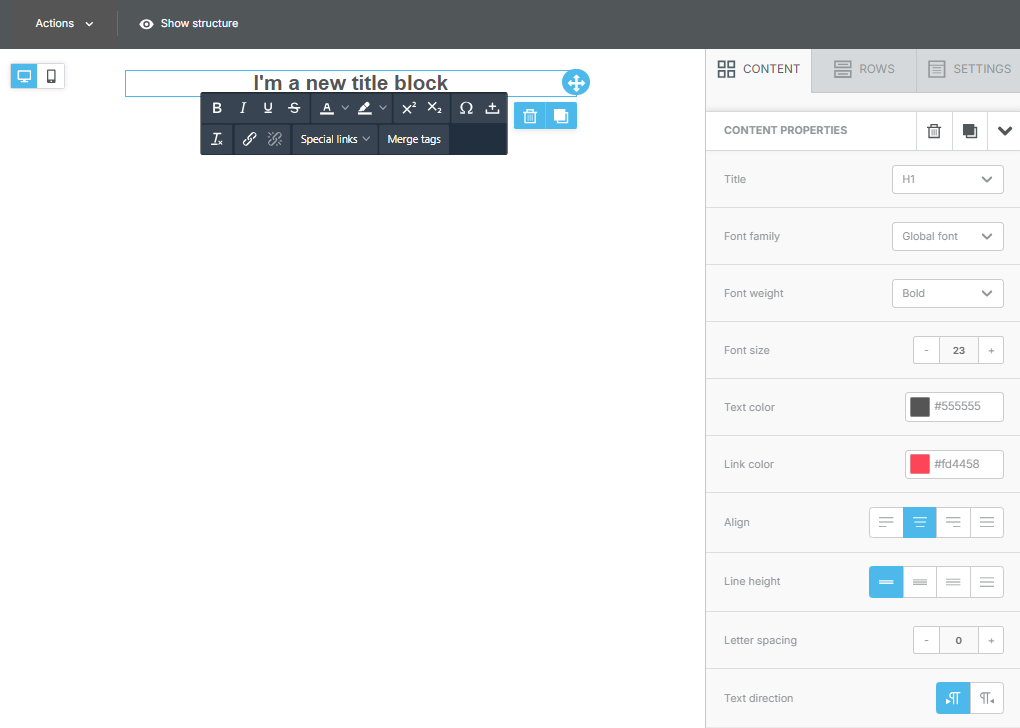
This tool is ideal for highlighting important sections of the message.
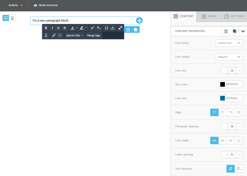
Paragraph
The Paragraph block is used for adding longer texts, such as descriptions or main content. Similar to the title block, you can click and edit the text directly once the block is placed in the workspace.
In the properties panel, you can customize the font, text size, color, alignment, add hyperlinks, and adjust internal padding to improve readability. This is a versatile tool for adding body and detail to your emails.
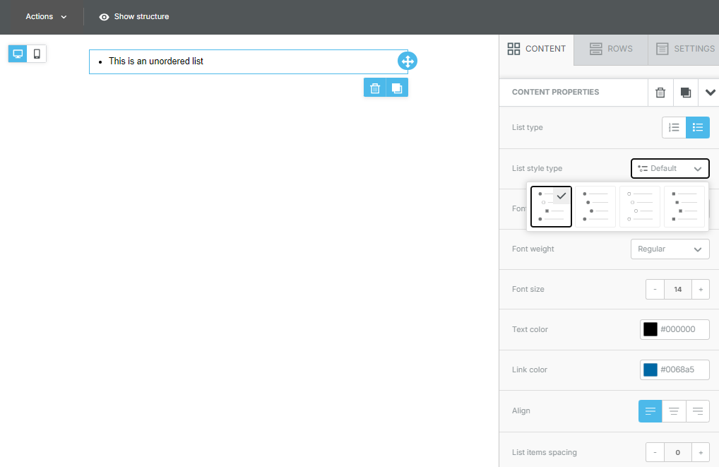
List
The List block is perfect for inserting bulleted or numbered lists in your emails. You can easily add bullet points, reorder items, and customize the style of the bullets or numbers directly in the properties panel. Like paragraphs, you can change the font, text size, color, and alignment and add spacing between list items for better readability.
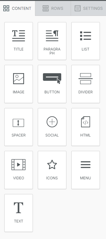
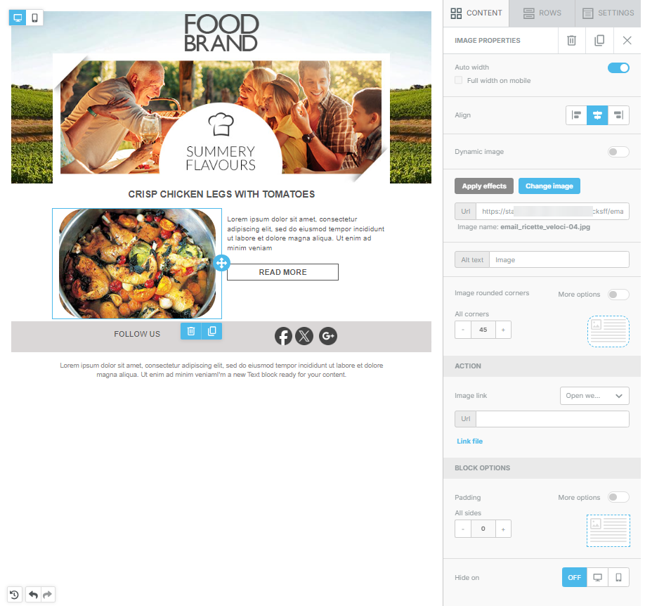
Image
The Image block allows you to insert images into emails. After dragging an image onto the canvas, you can upload a file from your computer or choose an image from the library.
With the integrated editor, you can modify images (crop, resize, add filters).
In the properties panel, you can add borders, links, and customize the internal padding around the image for better alignment with other content.
It is also possible to round the corners of images using the dedicated panel.
However, not all email clients, such as Outlook, support this functionality. In these cases, the image will be displayed with square corners.
Button
The Button block is perfect for adding call-to-action buttons, essential elements for encouraging recipients to take an action, such as visiting a website or completing a purchase.
After adding a button, you can modify its text and customize its style through the properties panel.
Customization options include changing the color, shape, and size, adding rounded corners, and linking the button to a specific URL.
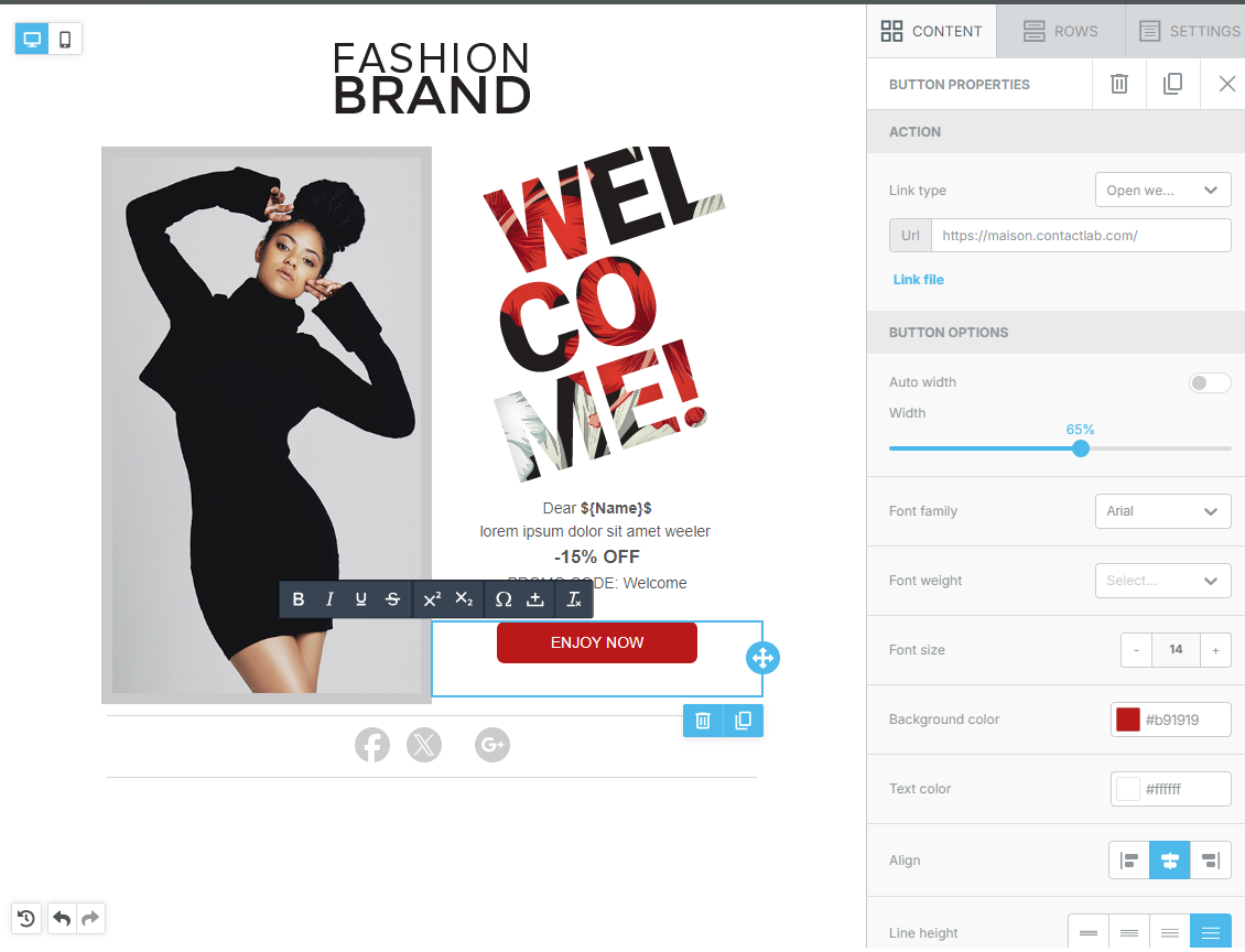
It is also possible to configure the hover effect, which allows you to apply style changes – such as background color, text color, or border style – that appear when the mouse cursor hovers over a button on desktop devices.
Hover effects can be previewed directly in the editor and the preview screen, providing immediate control over the result.
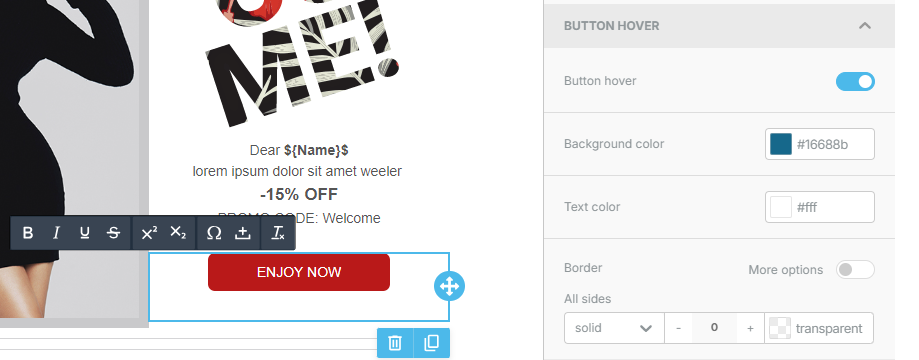
Hover effects are supported by approximately 60% of email clients but have significant limitations in Outlook for Windows.
If the email client does not support the hover effect, the recipient will see the standard button properties as they were designed, without any changes when the cursor hovers over the button.
Divider
The Divider block allows you to separate content sections with horizontal lines. You can customize the width, thickness, and style of the divider directly from the properties panel.
This helps create a clear and organized structure for the email, improving readability and visually separating different content blocks.
Spacer
The Spacer block is used to add empty space between design elements. This is useful for creating a break between sections of text, images, or other content, improving the readability and overall aesthetics of the email. You can adjust the height of the spacer in the properties panel to suit specific needs.
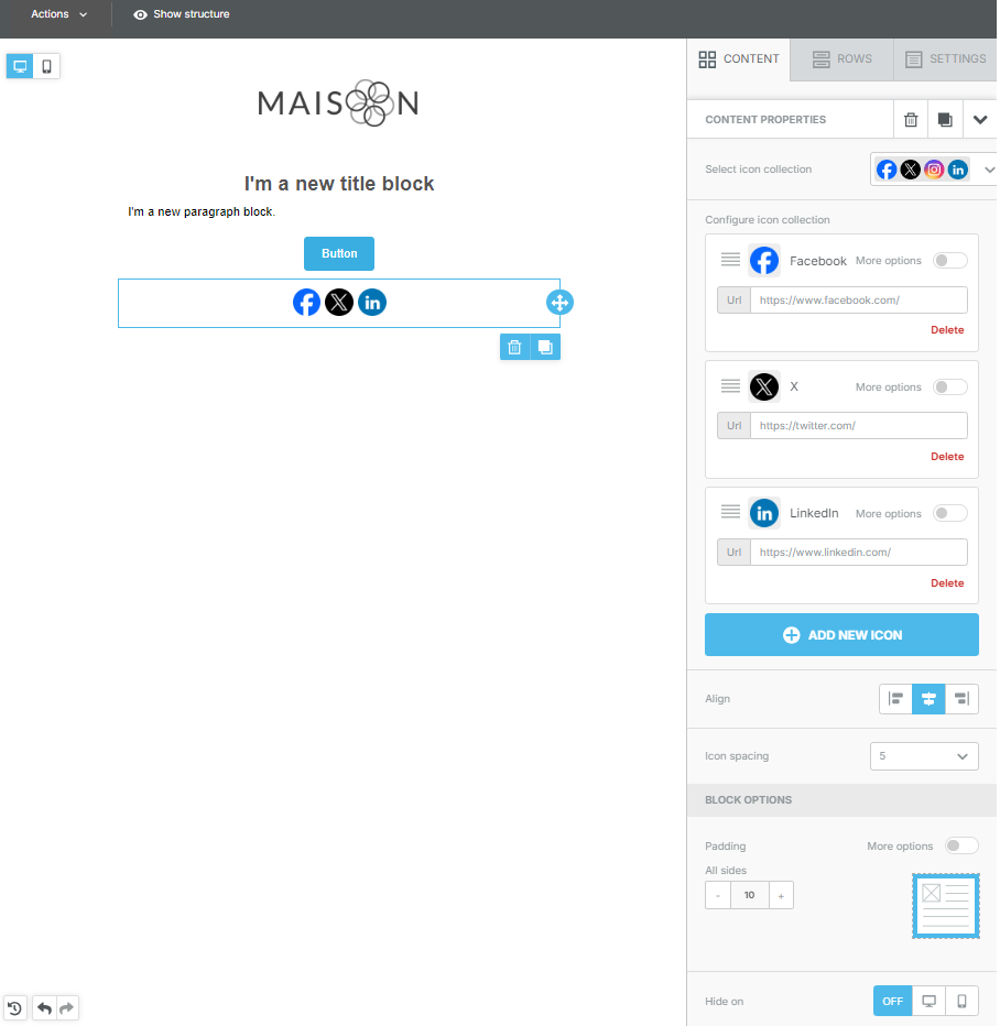
Social
The Social block allows you to add social media icons to your emails, linking them to your profiles on various platforms. You can select different icons for platforms like Facebook, Twitter, Instagram, and customize their appearance and links in the properties panel. This helps connect with recipients through social channels.
HTML
The HTML block is for users who want to insert custom HTML code into their emails. After dragging the HTML block onto the canvas, you can input the code and preview how it will appear in the email.
This block is useful for advanced features or specific customizations that are not possible with other blocks.
Video
The Video block allows you to embed videos. You can link videos from platforms such as YouTube or Vimeo. In the properties panel, you can configure the video preview and customize the size and borders.
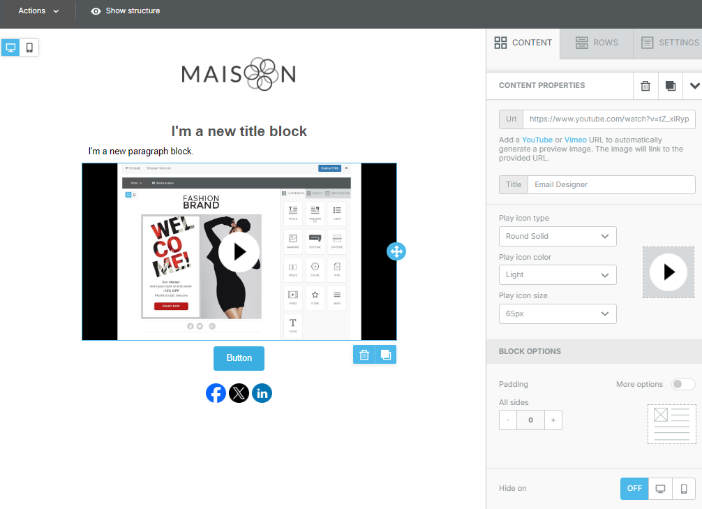
This is a great way to increase engagement and provide dynamic content to your recipients.
Icons
The Icons block allows you to add graphic icons to enhance visual communication. You can customize their color and size in the properties panel.
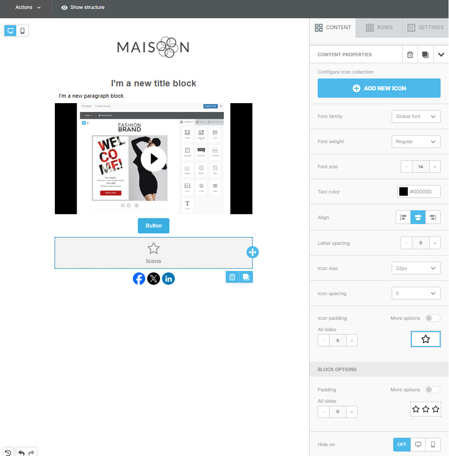
Icons can be used to represent concepts, features, or decorate the email.
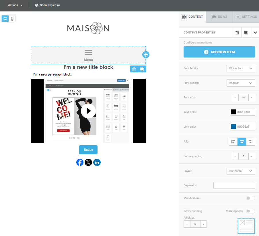
Menu
The Menu block is useful for creating a navigation bar within the email. You can add links to different sections or pages of your website, helping recipients easily navigate the content.
The properties panel contains options to customize the appearance of the menu, links, and their style, ensuring consistency with the email design.
Text
The Text block is perfect for adding textual content to the template.
When dragging a text block into the workspace, it can be edited immediately by clicking on it. You can change the content, adjust the font size, and apply effects such as bold, italic, and more.
Advanced options are available in the block properties panel, allowing you to:
- Define the text and link colors.
- Adjust the line height.
- Modify the spacing between letters.
- Set the internal spacing (padding) of the block.